


Basic Controls
The following picture demonstrates typical Graphical User Interface (GUI) of plugin:
Each plugin consists of the following elements:
- Audio File – audio file chooser and editor.
- Button – button control.
- Combo – combo box control.
- Combo Group – combo group control.
- Fader – fader control.
- File Saver – file saving control.
- Footer – plugin footer.
- Fraction – control for setting musical time signature.
- Graph – graphical output area.
- Group – group control.
- Header – plugin header.
- Indicator – digital LED indicator.
- Inline Display – inline display.
- Knob – rotating knob control.
- Label – label with text information.
- Led – LED.
- Meter – metering control.
- Overlay – widget container.
- Parameter – the value of controllable parameter.
- Progress Bar – progress control.
- Sample Editor – sample editor.
- Shared Memory Link – sample editor.
- Tab Control – tab control.
Colors of widgets may vary but the color scheme of widgets often follows these rules:
- Widgets that adjust parameters of similar objects are consolidated into one common group.
- Widgets that control parameters of one object often have similar colors.
- Widgets associated with audio channels often use the following color scheme:
- Moderate magenta – for thresholds.
- Moderate red – for mono channel and stereo channel (when both left and right channels are controlled at same time).
- Strong red and Soft blue – for left and right channels in stereo pair, direct output channel.
- Dark cyan and Dark lime green – for middle and side channels.
- Strong red – for left channel in stero pair.
- Soft blue – for right channel
- Bright red – for velocity.
- Dark orange – for balance.
- Soft violet – for envelopes.
- Strong orange – for sidechain.
- Moderate pink and Lime green– for attack and release.
- Olive tone and Moderate blue – for dry and wet.
- Each widget that allows to set continuous parameters has corresponding label displaying it's current value and, optionally, units.
Below the detailed description of controls is present.
Audio File
File widget – initial condition:

File widget – error message:

File widget – file loaded:
AudioFile widget is used for loading and editing audio files. It tells to the plugin the actual location of file on file system.
By default there is no file associated with plugin, so the file widget displays 'Click or drug to load' text.
By clicking left mouse button on the widget you may open file choosing dialog and select the file to use by plugin.
After the path to the file will be passed to plugin, the plugin starts to load the file, and the status displayed by the file widget changes. If file was successfully loaded, file widget will display the corresponding content of the file and it's name (without path). On error, error message is displayed with red color.
By clicking right mouse button, popup dialog appears that allows to cut, copy, paste and clear contents of widget
There is also the way to force plugin to unload file. For this purpose simply double-click by right mouse button on widget's area if popup menu does not appear.
Button
Buttons are mostly used to turn on/turn off some binary parameter. Rarely they are also used for switching between different processing modes (See LSP Delay Compensator Mono plugin for example). There are two different types of buttons:
- push/pop - these buttons allow to change the state of parameter and keep it until next button push occurs.
- trigger - these buttons allow to trigger some event while the button is pressed and return to initial state when the button is released.
Push/pop buttons may be pressed by left mouse button click and do not affect any parameter changes until the left mouse button is released over the button widget. It is possible to cancel button press by moving mouse cursor out of the widget's area or by additionally pressing right mouse button.
Trigger buttons have radically different behaviour. They trigger event on left mouse button click and every time they fall into pushed state. So there is possible to trigger sequence of events by pressing left mouse button over the button and repeatedly moving mouse cursor outside widget's area and back.
For space economy and clarity improving purposes buttons may be combined with LEDs.
Here is example of different button widgets:


Combo
Combo is a drop-down list that in normal state displays only currently selected item. When clicking by left mouse button, it shows drop-down list with all possible variants for choosing. Only one list item may be selected at the same time.
It is very useful for defining controls that use enumerations or for switching between different control groups.
Here is example of combo box widgets:
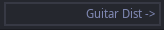
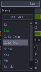
Combo Group
Combo group is a Group control that allows to select the displayed content by calling a drop-down list. The drop-down list is accessible by clicking with left mouse button the header header of the group.
Here is example of combo group widget:
When clicking the group header, we get all possible variants for choosing widget groups for displaying:
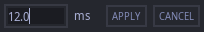
Fader
The Fader widget allows to adjust value for continuous parameters in the pre-defined range.
It is possible to achieve more precision by using the right mouse button instead of left when changing fader's value.
To cancel editing, the opposite mouse button should be pressed (right if used left and vice verse).
To reset parameter to it's default value, issue double click by the left mouse button.

File Saver
This widget allows to choose the file and tell plugin to save some data to it. It also allows to display progress and status of operation.


Footer
The footer is located at the bottom of plugin and allows to adjust some parameters available in the main menu:
- Show manual for the plugin.
- Adjust the UI scaling for high-DPI displays.
- Adjust the font scaling for people with disabled vision.

Fraction
This widget allows to set-up time signature of the audio that is present as a fraction where top and bottom parts are integer values. Both numerator and denominator of fraction is adjustable by mouse wheel. Also, when clicking numerator or denominator with left mouse button, popup list box appears that allows to quickly set the required value.

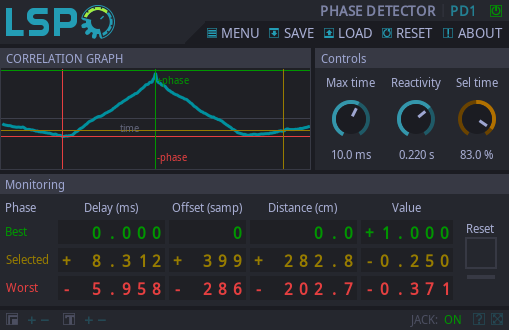
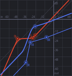
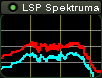
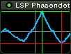
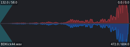
Graph
Graph is special widget for displaying graphical information about processes that flow in the DSP core of plugin. It may contain lines, text labels, different curves (meshes), markers and dots.
Example of graph widget:
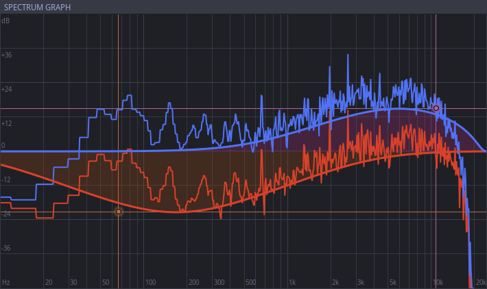
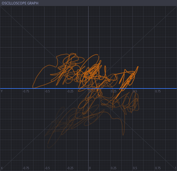
All elements of graph except dots can not change input parameters of plugin. Dots may control simultaneously up to three parameters by the following events:
- moving dot horizontally;
- moving dot vertically;
- scrolling mouse wheel over the dot.
By moving dot over the graph widget two parameters may be changed simultaneously. This can be done by left-clicking on the dot, holding mouse button and moving mouse cursor over the graph widget's area. Also, additional tolerance may be reached by right-clicking the dot instead of left-clicking, this makes the change of parameters more accurate. The movement may be cancelled by pressing the opposite button of the mouse.
Additional tolerance for mouse scroll may be achieved by pressing shift key on keyboard
Example showing dot controls:
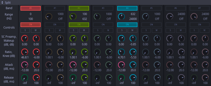
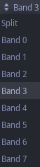
Group
Group widget is a special widget that allows to visually distinguish set of widgets that control parameters of some device or set of similar devices.
Example showing controls consolidated into group:
Header
Header delivers the basic information about the plugin and allow to perform primary control over the plugin settings. It consists of the following elements:
- LSP Logo at the left
- Plugin name at the top
- Plugin model code near to the plugin name.
- Bypass button at the right of the plugin name.
- Main menu bar that consists of the following elements:
- Menu – triggers the main plugin menu.
- Save – launches the dialog that allows to save the configuration of plugin to confiruation file.
- Load – launches the dialog that allows to load the configuration of plugin from confiruation file.
- Reset – resets the state of plugin to the default. Requires a confirmation as a protection from accidental click.
- About – shows the dialog which displays all necessary information about the plugin
The main menu allows to perform the following actions on plugin instance:
- Show manual for the plugin and for the controls.
- Export plugin settings to file and clipboard.
- Import plugin settings from file or clipboard or some special file format (like Hydrogen drumkits or RoomEqWizard filters).
- Create an internal state dump of plugin for shipping an issue report to developers.
- Select the default lanuguage of the user interface.
- Adjust the UI scaling for high-DPI displays.
- Adjust the font scaling for people with disabled vision.
- Change the visual schema for widgets.
- Select the 3D rendering backend if plugin requires 3D rendering.
- Apply different built-in presets if they are present and supported by the plugin.
Plugins typically use the following model code format: XXXX MM NN CC, where:
- XXXX – arconym from the full name of plugin, for example GE for Grafischer Entzerrer.
- MM – modifiers that show additional facilities of plugin like M (MIDI) or SC (Side chain)
- NN – number of devices that work simultaneously. For example, 16 filters for the equalizer.
- CC – channels that plugin operates:
- M – mono;
- S – stereo;
- D – stereo with additional direct output channel;
- LR – stereo, but separately left and right channels;
- MS – middle and side channels.

The content of the exported/imported text file can be manually edited. Each parameter has detailed description. Below an example of the configuration file is present:
	#-------------------------------------------------------------------------------
	#
	# This file contains configuration of the audio plugin.
	#   Plugin name:         Verzögerungsausgleicher Mono (Delay Compensator Mono)
	#   Plugin version:      1.0.0
	#   LV2 URI:             http://lsp-plug.in/plugins/lv2/comp_delay_mono
	#   VST identifier:      jav8
	#   LADSPA identifier:   5002065
	#
	# (C) Linux Studio Plugins Project
	#   https://lsp-plug.in/
	#
	#-------------------------------------------------------------------------------

	# Bypass: true/false
	bypass = false

	# Mode: 0..2
	#   0: Samples
	#   1: Distance
	#   2: Time
	mode = 2

	# Samples [samp]: 0..10000
	samp = 0

	# Meters [m]: 0..200
	m = 0

	# Centimeters [cm]: 0.000000..100.000000
	cm = 0.000000

	# Temperature [°C]: -60.000000..60.000000
	t = 20.000000

	# Time [ms]: 0.000000..1000.000000
	time = 3.349236

	# Dry amount [G]: 0.000000..10.000000
	dry = 0.000000

	# Wet amount [G]: 0.000000..10.000000
	wet = 1.000000

	# Output gain [G]: 0.000000..10.000000
	g_out = 1.000000

	#-------------------------------------------------------------------------------
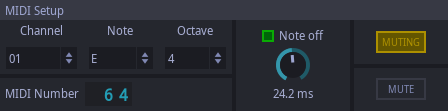
Indicator
Indicators are widgets that display measured or computed value by the plugin.
Example of indicator widget:
Inline display
Inline displays are not widgets or elements of plugin's UI at all. Instead of this, they're part of the host UI since the Ardour DAW implemented Inline Display extension for LV2 format.
So they're available in the Ardour's mixer strip even if UI is not shown. Inline displays also are available in Mixbus DAW as the relative to Ardour product.
Because inline display is an LV2-specific extension, it is available only for LV2 version of LSP plugins. But standalone JACK versions of plugins that support inline displays in LV2, draw them on window's icon.
Example of inline displays:
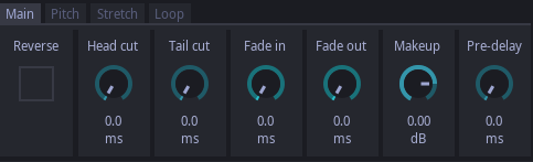
Knob
Knobs are the mostly used controls by plugin GUIs. They allow to adjust value for continuous parameters in the pre-defined range. Highlighted part of the knob's scale shows deviation from it's zero position. There are many ways to adjust the controlled parameter.
The first way to change the parameter is performing left mouse click on the knob's cap, holding mouse button and moving cursor up and down. To apply more accurate adjustment, right button of mouse may be pressed while moving cursor.
The second way to change parameter's value may be reached by using mouse scroll. To perform more accurate adjustment, shift key may be pressed on keyboard. To accelerate the adjustment, control key may be pressed on keyboard.
For all knobs (especially when they are stiff) quick adjustment of parameter may be achieved by left-clicking knob's scale. Also, additionally mouse button may be hold and parameter will be adjusted by moving mouse clockwise/counter-clockwise.
Note, that knob scale actions can be enabled or disabled by the additional 'UI behavior' → 'Editable knob scale' option.
To reset parameter to it's default value, left mouse button double click may be issued.
Note that in most cases additional 'Parameter' widget that displays the actual value of the parameteris located nearby the knob . While the knob widget allows to adjust the value with some step, the 'Parameter' widget allows to set the precise value by double-clicking the displayed value and entering the new desired value by the keyboard.
Example showing knob controls:


Label
Labels are widgets that display static text information.
Example of label widgets:
Led
LEDs are used to display state of binary output parameter.
Example of LEDs:

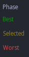
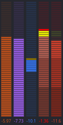
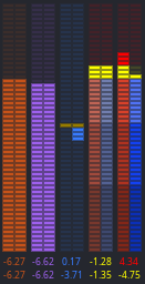
Meter
Meters are used for metering some values (mostly, levels of the audio signal). They may contain yellow and red zones. They respectively show that signal exceeds -6dB and 0dB levels.
Example of meters:
Overlay
Overlays are special widget containers designed to hide rarely used controls from regular user while keeping the power, functionality and flexibility of the plugin. These widget allow to show on demand set of additional controls laying on the top of plugin's window. Usually it is done by special button.
Example of overlay:

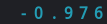
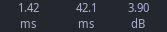
Parameter
Parameters are widgets that display the actual value and measuring units of some controlled parameter. It is possible do double-click the parameter and enter it's value manually in the popup window.
Progress Bar
Progress Bar is a widget for monitoring execution progress of offline tasks. It shows the actual completion percentage of the background job.
Example of progress bar:

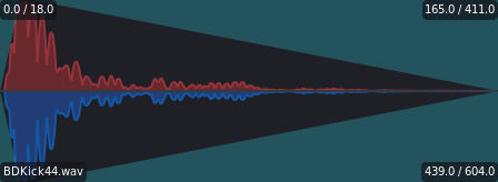
Sample Editor
Sample Editor widget is used for viewing and editing audio samples. It is similar to AudioFile wiget but unlike AudioFile widget, it does not allow to load files from file system.
By default if there is no sample data, the file widget displays 'No data' text.
Example of sample editor widget:
Shared Memory Link
The shared memory link allows to connect plugins via a shared memory segment. This allows one set of plugins to allocate some named shared memory segment and submit some data (like audio stream) to it. The other set of plugins can connect to the shared memory segment and read data from it. Some plugins allow to work with multiple shared memory segments as both readers and writers.
Shared memory link is a very versatile feature that allows to communicate plugins of different formats and of different kinds and do some cooperative work.
The shared memory link control looks similar to button. By default it shows the 'Send...' or 'Link...' text that indicates that currently there is no connection estimated to the shared memory segment. When connected, it shows the name of the shared memory segment and the direction of the connection:
- the arrow at the left of the link name indicates the link being audio send (output only);
- the arror at the right of the link name indicates the link being audio return (input only);
- the equation at the left of the link name indicates the link being some unidirectional readable and writeable shared memory structure.
When clicking the shared memory link, the popup dialog appears that allows to enter the name of new shared memory segment or choose the already existing one. The input field also acts as a filter for filtering all available shared memory segments.
Example of sample editor widget:

Tab Control
Tab control allows to group multiple elements into tabs. When a specific tab is active, the only set of controls that belong to the tab becomes visible.
Example of the tab control:


