UI Development Guidelines
Foreword
Before introducing any changes to the user interface, it is very important to carefully consider their necessity and possible side effects. It is important to understand how these changes will affect end users and ensure that they won’t complicate or disimprove the user experience.
It is also important to count that any changes in the user interface may require additional time spendings for development and testing. Also it is very important to estimate how these changes can make the final product better.
Common terms
The main principle of the LSP Plugins’ user interface creation is the compactness.
Althroug plugins are present as standalone applications and built-in plugins for DAW, it is important to make the plugin window as compact as possible. It is needed to make the end user possible to simultaneously work with multiple plugins on the same screen.
The main complexity of creation of the UI is that LSP Plugins, as usual, provide many controllable parameters available to the user. That gives wide tuning possibilities, higher precision and flexibility to the workflow, so all these controls should be displayed in the plugin’s window.
In other words, it is important to find compromises between the compactness and the comfortability of the use.
Block and table system
We use the mix of block and table system while developing the UI - this is a markup plinciple based on usage of tables and nested elements - widgets.
Widget is a small interactive element which can provide different functions and act as some view of some information or some control which allows to modify some information.
Widgets can be grouped into blocks and placed at some position of the table — such mmix of block and table markup allows to define the position and the structure of widgets in the plugin’s window.
Basic principles
- The plugin’s window becomes split into separate blocks, each of them can contain it’s own properties: the color of the background, the padding, the minimal width, etc. The size of paddings, minimal size, etc is counted in nominal pixels.
- Also block can be built-in into another block. This allows to create more complicated strutures.
- Blocks can inherit some features of parent blocks. For example, the color of the background.
- We use tags for the definition of the window structure and location of the blocks.
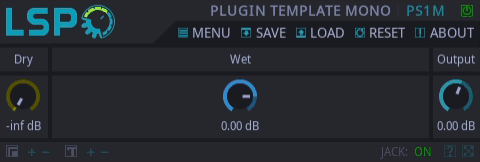
The example below demonstrates the markup of very simple interface for some plugin.
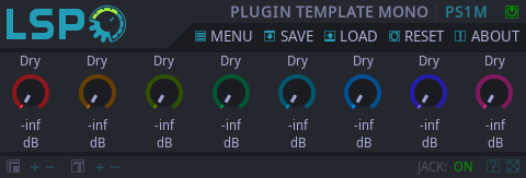
<plugin resizable="true">
  <hbox bg.color="bg_schema" pad.v="4">
    <vbox spacing="4">
      <label text="labels.signal.dry"/>
      <knob id="dry" scale.color="dry"/>
      <value id="dry"/>
    </vbox>
    <vbox spacing="4">
      <label text="labels.signal.wet"/>
      <knob id="wet" scale.color="wet"/>
      <value id="wet"/>
    </vbox>
    <vbox spacing="4">
      <label text="labels.output"/>
      <knob id="g_out"/>
      <value id="g_out"/>
    </vbox>
  </hbox>
</plugin>
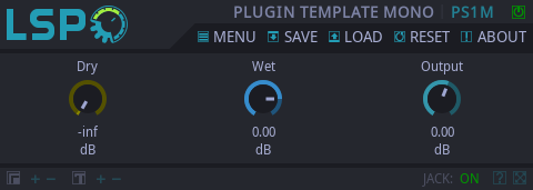
And this is how this interface looks out.
- If the structure is more complicated than set of several blocks placed into one single horisontal or vertical line, it is recommended to use grid and place blocks and widgets into separate cells of the grid.
<plugin resizable="true">
  <grid rows="3" cols="3" spacing="4"
      bg.color="bg_schema" pad.v="4">
    <!-- Row 1 -->
    <label text="labels.signal.dry"/>
    <label text="labels.signal.wet"/>
    <label text="labels.output"/>
    <!-- Row 2 -->
    <knob id="dry" scale.color="dry"/>
    <knob id="wet" scale.color="wet"/>
    <knob id="g_out"/>
    <!-- Row 3 -->
    <value id="dry"/>
    <value id="wet"/>
    <value id="g_out"/>
  </grid>
</plugin>
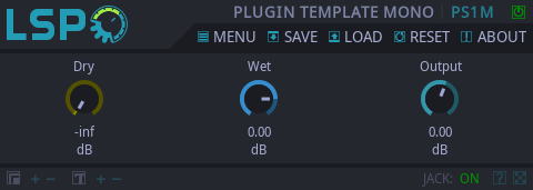
At the first glance, the UI looks the same to the previous example. But actually the grid is much better dealing with the space allocation between widgets and their placing.
- We use schemas to define styles for block’s elements (located in the following project’s relative path: lsp-plugins/modules/lsp-plugins-shared/res/main/schema), which contain predefined colors, widget properties and their
behavior. It is also possible to set widget attributes using tag’s attributes as we saw it in the example above with knob widgets: <knob id="dry" scale.color="dry" />.
Such markup allows to have more flexible control over the location of elements within plugin’s window and make the overall UI design adaptive. - For better understanding of how does it all work together, it is better to perform the one’s own analysis of one of already designed plugins.
Color and style schemes
The style scheme includes all the information about what colors, paddings, sizes etc will be utilized by widgets.
Preconfigured style in the Modern.xml schema:
<style class="Group" parents="root">
    <color value="bg_name"/>
    <border.size value="0"/>
    <text.color value="text_group"/>
    <text.radius value="0"/>
    <ipadding value="6"/>
    <padding value="0"/>
    <border.radius value="0"/>
    <bg.color value="bg_light"/>
    <heading value="-1 1"/>
    <text.padding.left value="6"/>
</style>
Preconfigured style in the Legacy.xml schema:

<style class="Group" parents="root">
    <color value="bg_name"/>
    <border.size value="2"/>
    <text.color value="text_group"/>
    <text.radius value="10"/>
    <ipadding value="12"/>
    <padding value="0"/>
    <border.radius value="10"/>
    <bg.color value="bg"/>
    <heading value="-1 0"/>
    <text.padding.left value="6"/>
</style>
The user interface of LSP Plugins allows to use multiple schemas which can be switched in runtime (without need to reload) by using one of the menu items listed in the menu→visual schema menu.
Scheme "Modern":
Scheme "Legacy":
Scheme "Legacy Dark":
One important rule: if some color was added to one shema, it should also be added to other schemas. It is also imporant to check how new added color affects the look of related widgets for these schemas.
Basic color rules and solutions
In the "MODERN" schema all colors are organized according to the LCH (or HCL) color space which is based on LAB color space. In such color space all colors have perceptual uniformity. That means, that in LCH color space all colors that have the same lighness are perceived as colors that have the same lightness, and all colors that have the same chromaticity are percieved as colors with the same chromaticity.
Such decision was made for the purpose of making the interface soft and not too motely, and also to make the individual elements not changing the brightness depending on the color tone (as a counterversive part to HSL color space in the "Legacy" schema).
It is much easier to understand if we grayscale the pictures for "Modern" and "Legacy" schemas.

Anyway, it is much easier to add the color to the «Modern» schema just by choosing one of colors from the palette below.
In schemas many parameters already have their colors, here are some of them:
<!-- Knob and meshes colors -->
<mono_in value="#bf6455"/>
<mono value="#d8412a"/>
<left_in value="#bf6455"/>
<right_in value="#717eae"/>
<left value="#d8412a"/>
<right value="#5072f4"/>
<mid_in value="#52888e"/>
<side_in value="#538c50"/>
<mid value="#0090a1"/>
<side value="#009700"/>
<velocity value="#da404a"/>
<balance value="#b07000"/>
<fader_balance value="#b07000"/>
<balance_l value="#b07000"/>
<balance_r value="#868200"/>
<envelope value="#9e60ee"/>
<envelope_1 value="#9e60ee"/>
<envelope_2 value="#8d76aa"/>
<sidechain value="#c65219"/>
<sidechain_1 value="#c65219"/>
<sidechain_2 value="#b36c49"/>
<threshold value="#c344d3"/>
<threshold_1 value="#c344d3"/>
<threshold_2 value="#c344d3"/>
<attack value="#c2487b"/>
<attack_1 value="#c2487b"/>
<attack_2 value="#c2487b"/>
<release value="#009555"/>
<release_1 value="#009555"/>
<release_2 value="#009555"/>
<dry value="#8c8700"/>
<wet value="#368ccc"/>
<lufs value="#8ab252"/>
<bright_lufs value="#bee784"/>
<dark_lufs value="#557c1e"/>
That’s why before adding new color to the widget’s property it is important to ensure that it is not already defined in the schema.
The color in color schema should reflect the meaning of the entity it is operating or the process it is responsible for. In other words, "button_green" is a bad name for the color because even if it is green in current schema, it can
suprisingly become of another color in another schema. By the other side, "button_threshold" is a good color name because it tells about the function of the element it is associated with.
The value of the color can be defined in multiple ways (capital letters mean hexadecimal digits while lower-case letters mean floating-point values often normalized to range 0.0 to 1.0):
- RGB: #RGB, #RRGGBB, #RRRGGGBBB, rgb(r, g, b);
- RGBA: #ARGB, #AARRGGBB, #AAARRRGGGBBB, rgba(R, G, B, A);
- HSL: @HSL, @HHSSLL, @HHHSSSLLL, hsl(H, S, L)
- HSLA: @AHSL, @AAHHSSLL, @AAAHHHSSSLLL, hsla(H, S, L, A);
- HCL: hcl(h, c, l);
- HCLA: hcla(h, c, l, a);
- LAB: lab(l, a, b);
- LABA: laba(l, a, b, a);
- CMYK: cmyk(c, m, y, k);
- CMYKA: cmyka(c, m, y, k, a).
The color is considered fully transparent when the normalized value of the alpha component (a, A) is 1.0, and fully opaque when the normalized value of the alpha component is 0.0. That allows to omit the alpha value for definition of fully opaque colors.
It is strongly not recommended to explicitly define the value of the color in plugin’s UI markup file. Otherwise switching schemas will yield to unexpected results caused by hard-coded colors not blending together with other elements. To prevent such problem, it is strongly recommented to define all colors in schema files.
If widgets are of the different kind but carry the same meaning, it is important to make them of the same color. It helps to preserve the common style and provide the consistency of the interface.
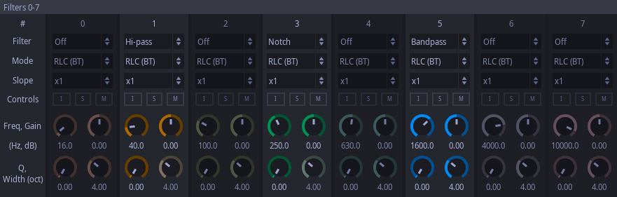
Gray tones are used only for inactive (disabled) elements and we don’t use it for any plugin’s parameter.
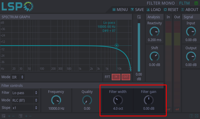
In the example below the selected filter does not provide band width nor gain controls, that’s why corresponsing widgets were of the gray color.
The markup language allows to use loops for building multiple blocks of the same pattern.
In the example below we can color widgets by setting the base color and altering it’s tone by setting different values to the «hue» attribute proportionally to the value of the iterator variable:
<plugin resizable="true">
  <grid rows="3" cols="8" bg.color="bg_schema" spacing="4" transpose="true">
    <ui:for id="i" first="0" count="8">
      <label text="labels.signal.dry"/>
      <knob id="dry" scolor="cycle" scolor.hue="${:i * 0.125}"/>
      <value id="dry"/>
    </ui:for>
  </grid>
</plugin>
This allows to gain the following result:
There are three colors defined for the background in "Modern" schema. Usually, the first color is used by separators and paddings, the second color is used for primary background, the third one is the primary backround for widgets in inactive state.
Instead of higlighting some active element, it is decided in LSP to darken inactive elements. In other words, the block containing widget and all widgets in this block become darken. Scales, buttons, meters and other colored widgets become grayscale (excluding the active ones).
In common case it can be performed by manipulating the value of bg.color, and bg.bright properties.
It is generally accepted to use spacing between blocks of 4 nominal pixels, sometimes additionally separators are applied. The difference between spacings and separators is that separators allow to logically separate widgets in the same block. It is recommended to use separators of the following kind: <vsep pad.h="2" bg.color="bg" hreduce="true"/> or <hsep pad.v="2" bg.color="bg" vreduce="true"/>.
Such separators will be visible in other schemas where the color of the background is not altering:
<plugin resizable="true">
  <grid rows="4" cols="5" bg.color="bg_schema">
    <!-- Row 1 -->
    <label text="labels.signal.dry" pad.v="4"/>
    <cell rows="4">
      <vsep pad.h="2" bg.color="bg" hreduce="true"/>
    </cell>
    <label text="labels.signal.wet" pad.v="4"/>
    <cell rows="4">
      <vsep pad.h="2" bg.color="bg" hreduce="true"/>
    </cell>
    <label text="labels.output" pad.v="4"/>
    <!-- Row 2 -->
    <hsep pad.v="2" bg.color="bg" vreduce="true"/>
    <hsep pad.v="2" bg.color="bg" vreduce="true"/>
    <hsep pad.v="2" bg.color="bg" vreduce="true"/>
    <!-- Row 3 -->
    <knob id="dry" scale.color="dry" pad.v="4"/>
    <knob id="wet" scolor="wet" pad.v="4"/>
    <knob id="g_out" pad.v="4"/>
    <!-- Row 4 -->
    <value id="dry" pad.b="4"/>
    <value id="wet" pad.b="4"/>
    <value id="g_out" pad.b="4"/>
  </grid>
</plugin>
Internal paddings for widgets of the same block have 6 nominal pixels in the horizontal direction and 4 nominal pixels in the vertical direction.
While designing the user interface, it is generally accepted to always show all possible elements like knobs, combo boxes, buttons, etc. If under certain conditions widget is useless, we don’t hide it from the UI but make inactive (gray color and dark background if necessary). This allows to make the UI look more stable, no window resize nor content flickering happens.
It is strongly recommended to verify the maximum and minimum values of the <value> widget. For this pupose just put the corresponding control element into the minimum and maximum positions. If the values are flickering and force to flicker the neighbor widgets, it is required to explicitly specify the minimum widget width that allows to fully fit the minimum and maximum value text.
<plugin resizable="true">
  <grid rows="4" cols="5" bg.color="bg_schema">
    <!-- Row 1 -->
    <label text="labels.signal.dry" pad.v="4"/>
    <cell rows="4">
      <vsep pad.h="2" bg.color="bg" hreduce="true"/>
    </cell>
    <label text="labels.signal.wet" expand="true" pad.v="4"/>
    <cell rows="4">
      <vsep pad.h="2" bg.color="bg" hreduce="true"/>
    </cell>
    <label text="labels.output" pad.v="4"/>
    <!-- Row 2 -->
    <hsep pad.v="2" bg.color="bg" vreduce="true"/>
    <hsep pad.v="2" bg.color="bg" vreduce="true"/>
    <hsep pad.v="2" bg.color="bg" vreduce="true"/>
    <!-- Row 3 -->
    <knob id="dry" scale.color="dry" pad.v="4" pad.h="6"/>
    <knob id="wet" scale.color="wet" pad.v="4"/>
    <knob id="g_out" pad.v="4" pad.h="6"/>
    <!-- Row 4 -->
    <value id="dry" pad.b="4" same.line="true"/>
    <value id="wet" pad.b="4" same.line="true"/>
    <value id="g_out" pad.b="4" same.line="true"/>
  </grid>
</plugin>
On the picture above we observe the flickering of the UI when adjusting the value of the "Dry" knob. To solve this, we alterate the tag <value id="dry" pad.b="4" same.line="true"/> and append additional property width.min="48". Finally the tag now looks like this: <value id="dry" pad.b="4" same.line="true" width.min="48"/>. The result is on the picture below:
The interface allows to change it’s size on the fly: change the size of the window and scale the size of the nominal pixel. So it is important to verify how the plugin will look like when the window becomes expanded to the full screen. It is important to ensure that the only designed for expanding elements will take the free space while other elements will keep their sizes.
Normal size:
Full screen size:
The properties expand, vexpand, hexpand are responsible for expanding the widgets. If the only one element in the grid will contain such property, then only this widget will take the maximum possible space. In the case when there are more than one expanding widgets, then they will share the space proportionally to their sizes. Usually these properties are applied to graphs or widgets that provide some visual information.
Sections and components
The interface is split into three parts: top panel, the body and the bottom panel.
Top panel
At the left the logo is located. At the top right corner the name of the plugin is placed. At the right bottom corner global controls are placed which are common for all plugins.

Body
In the plugin’s body are located wigets responsible for the plugin’s configuration and for display of actual plugin’s state.
In the body of the plugin there can be such elemens as:
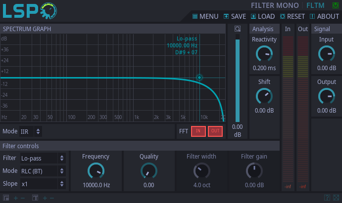
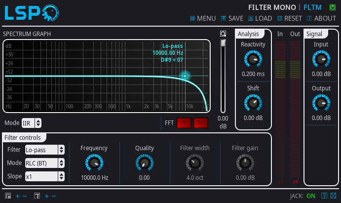
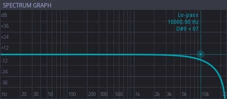
Graph
The graph widget can contain necessary curves displaying, for example, the spectrum of the signal, or control elements like dots and markers.
It is generally accepted to add the title to the graph. For example, the «Spectrum graph» below:
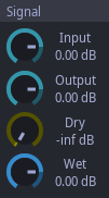
Group
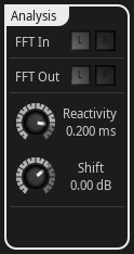
In this widgets the widgets of the same meaning or functionality are usually placed. For example, the knobs that control the levels of input and output signals. The group can contain some heading or can not contain it.
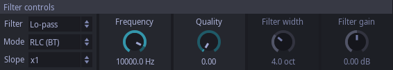
There are also widgets of the same to <group> meaning: <tabs> and <cgroup>. They are designed for paging purpose and paginized access to the huge amount of control elements such as filter parameters in the equalizer or differens sample manipulations in sampler.
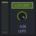
It is also commonly accepted to group together widgets of the similar meaning or related to the same actions. They can be not organized into groups but split with separators as it done with LUFS control in the clipper plugin. The <ledmeter>, <button> and <knob> are placed in the same block.
Label
This widget is used to deliver some text information. It is strongly denied to hard-code the text of the label inside of the markup file if it can contain non-numeric value. All values and parameters should be added to localization files in JSON format. Meanwhile the associated localization key should be of the similar sense the text of the label is holding. It is required to add localization keys and localization values at least into two sub-trees: default and us. But if you’re the native speaker of other languages present in the localization tree, it is a good tone to add translations for your native language, too.
Value
This widget is also designed to deliver some text information. The main difference to the label is that it displays the actual value of some plugin’s parameter.
Buttons
Buttons are widgets that allow to turn on, turn off, switch the parameter or act as a trigger. It is allowed to place some text inside of the button related to some parameter or action the button is dealing with. The rules of adding text are the same to the rules of adding text to the label. There are some predefined styles in the schemas for buttons. For example, "Button_stretch_8". The "stretch" word means that this button is related to the stretching functions and is associated with colors that are coding the stretching function. The number "8" informs about the size of the text inside of the button.
Meters
This type of widgets usually displays the loudness level or the level of impact. It is accepted to supply some label near the meter widget for better understanding of the entity or process it is associated with. As an exception, the clarifying label can be omitted when the designation of the widget is obvious even without any captions. For example, when the meter is placed in the same group with some single parameter.
Fader
This widget can be horizontal or vertical. The main sense of this widget is to change plugin’s parameters. It is very often used for control over zoom on graph widgets.
Knobs
Same to the fader, knobs are designed for control over some plugin’s parameter. The same way to the buttons knobs also have predefined styles in schemas. Knob allows to change many parameters like it’s overall size or the width of the scale but in many cases with the purpose of the color coding the color of the knob’s scale is altered.
Bottom panel
The bottom panel contains elements which are common for all plugins. The buttons for window sizing, text sizing, UI scaling. This panel is accepted for placing only of control elements shared by all plugins and rarely used.

It should be noted that the overall plugin design and concept of the concrete schema should be taken into attention. The newly created widget should follow the common scheme, for example not use corner rounding for the schema where the corner rounding is not used.
It is also should be noted that the LSP toolkit contains much more widgets but their detailed description will take much more time. LSP Project’s team will prefer to spend time for introduction new functionality. But initiative and contribution to the project are affordable and welcome.
To understand the complete set of attributes provided by the widget, it is a good reason to look inside the code of the widget placed in the lsp-tk-lib library and find it’s style definition.
For example, in the Knob.cpp file contains the following style definition:
LSP_TK_STYLE_IMPL_BEGIN(Knob, Widget)
    // Bind
    sColor.bind("color", this);
    sScaleColor.bind("scale.color", this);
    sBalanceColor.bind("balance.color", this);
    sHoleColor.bind("hole.color", this);
    sTipColor.bind("tip.color", this);
    sBalanceTipColor.bind("balance.tip.color", this);
    sMeterColor.bind("meter.color", this);
    sSizeRange.bind("size.range", this);
    sScale.bind("scale.size", this);
    sValue.bind("value", this);
    sStep.bind("step", this);
    sBalance.bind("value.balance", this);
    sMeterMin.bind("meter.min", this);
    sMeterMax.bind("meter.max", this);
    sCycling.bind("value.cycling", this);
    sScaleMarks.bind("scale.marks", this);
    sBalanceColorCustom.bind("balance.color.custom", this);
    sFlat.bind("flat", this);
    sScaleActive.bind("scale.active", this);
    sMeterActive.bind("meter.active", this);
    sEditable.bind("editable", this);
    sHoleSize.bind("hole.size", this);
    sGapSize.bind("gap.size", this);
    sScaleBrightness.bind("scale.brightness", this);
    sBalanceTipSize.bind("balance.tip.size", this);
    sBalanceTipColorCustom.bind("balance.tip.color.custom", this);
    sInvertMouseVScroll.bind("mouse.vscroll.invert", this);
    // Configure
    sColor.set("#cccccc");
    sScaleColor.set("#00cc00");
    sBalanceColor.set("#0000cc");
    sHoleColor.set("#000000");
    sMeterColor.set("#88ff0000");
    sTipColor.set("#000000");
    sBalanceTipColor.set("#0000ff");
    sSizeRange.set(8, -1);
    sScale.set(4);
    sValue.set_all(0.5f, 0.0f, 1.0f);
    sStep.set(0.01f);
    sBalance.set(0.5f);
    sMeterMin.set(0.0f);
    sMeterMax.set(0.0f);
    sCycling.set(false);
    sScaleMarks.set(true);
    sBalanceColorCustom.set(false);
    sFlat.set(false);
    sScaleActive.set(true);
    sMeterActive.set(false);
    sEditable.set(true);
    sHoleSize.set(1);
    sGapSize.set(1);
    sScaleBrightness.set(0.75f);
    sBalanceTipSize.set(0);
    sBalanceTipColorCustom.set(false);
    sInvertMouseVScroll.set(false);
LSP_TK_STYLE_IMPL_END
LSP_TK_BUILTIN_STYLE(Knob, "Knob", "root");
Here we see that the LSP_TK_STYLE_IMPL_BEGIN macro defines new style class Knob which is derived from Widget style class (and contains it’s own properties). Next, we seee the block of code that performs bindinf of properties to the name of
style attributes in the XML schema file. In other words, the attribute <color> in the XML file will be associated with the sColor property in the source code when parsing the schema file.
A bit below one another block of code is placed — the initialization block which configures the default values for properties of this style.
The style definition is terminated by the LSP_TK_STYLE_IMPL_END macro.
But it is important not only to declare the style class but also to add a factory which will register this style class in the widget library. The macro LSP_TK_BUILTIN_STYLE is responsible for it. It also defines the name of the style in the XML
schema file ("Knob") and the name of the parent style the style is derived from ("root").


